If you’re a fan of snacks, chances are you’re familiar with the iconic Lay’s logo. Established in 1932, Lay’s is one of the world’s most popular snack brands. Named after its founder, Herman Lay, the brand is renowned for its crispy and delicious potato chips.
The Lay’s logo is instantly recognizable with its eye-catching yellow and red color scheme. It features white lettering on a banner surrounding a yellow circle. But did you know that there’s a hidden detail in the Lay’s logo that most people aren’t aware of?
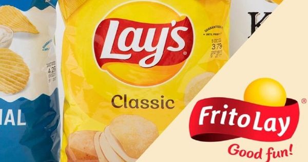
Take a closer look at the Lay’s logo, and you’ll notice something interesting—it bears a striking resemblance to the logo of its parent company, Frito-Lay. Frito-Lay, a subsidiary of PepsiCo, is responsible for manufacturing and distributing Lay’s chips worldwide.
The Frito-Lay logo showcases a 3D yellow ball resembling the sun, along with their iconic round yellow chip. Positioned above is a wide red ribbon with the white wordmark “Frito Lay” written on it. Below the emblem, the words “Good Fun!” are displayed. This design captures the brand’s joyful spirit and delicious snacks.
So, what does this hidden detail in the Lay’s logo mean? The connection between the Lay’s and Frito-Lay logos symbolizes the strong bond between these two brands. It represents the shared heritage and history that Lay’s has with its parent company.
Moreover, the sun logo of Frito-Lay holds even deeper significance. The sun is often associated with warmth, energy, and vitality. By incorporating the sun logo into the Lay’s branding, it conveys a sense of freshness and quality. It suggests that Lay’s chips are made with the finest ingredients and are bursting with flavor.
Additionally, the yellow and red color scheme used in the Lay’s logo is not just visually appealing but also has psychological implications. Yellow is often associated with happiness, optimism, and energy, while red is associated with passion, excitement, and stimulation. These colors create a sense of appetite stimulation, making us crave those delicious Lay’s chips even more.
Next time you reach for a bag of Lay’s chips, take a moment to appreciate the hidden detail in the logo. The resemblance to the Frito-Lay sun logo signifies the close relationship between these two brands and reinforces the quality and freshness associated with Lay’s chips.
So, whether you’re savoring a classic Lay’s Original or indulging in one of their unique flavors, remember that the Lay’s logo carries more meaning than meets the eye. It’s a symbol of the brand’s rich history and dedication to delivering delightful snacks to snack lovers worldwide.
And if you’re curious about hidden meanings in other famous brands, you’ll be surprised by what you discover about Wendy’s logo!